Desejo Ourocard & Caixa de Prêmios
Outcome
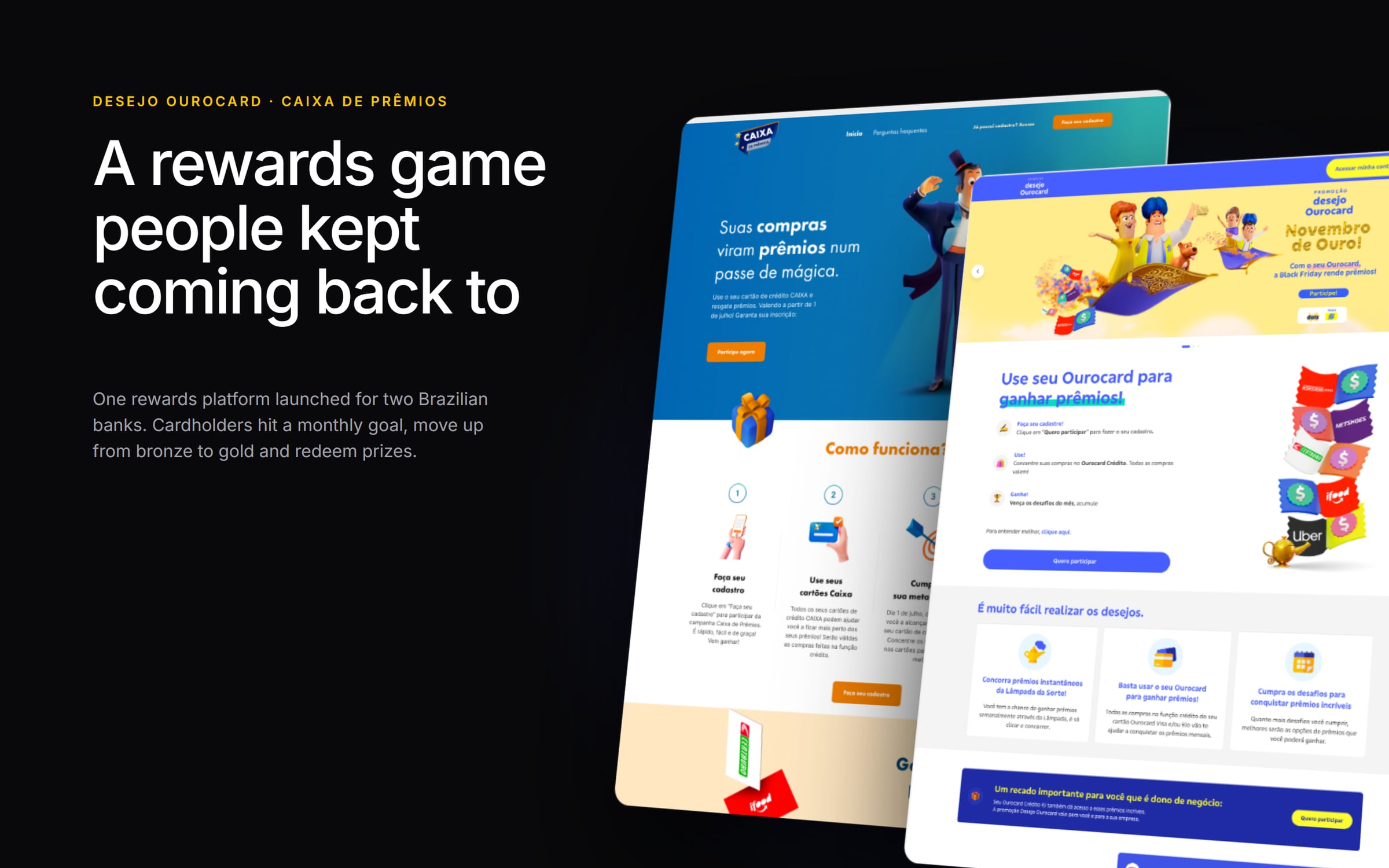
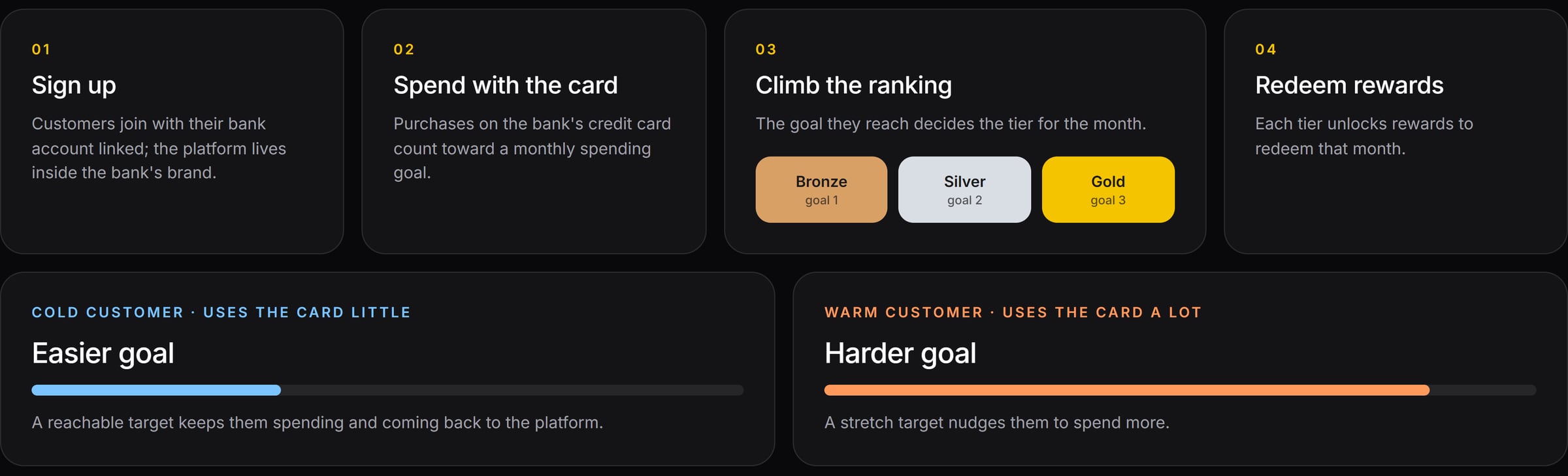
Banks want their customers to use their cards more and stick around longer. At Dotz we built one rewards platform and launched it under two brands: Desejo Ourocard for Banco do Brasil and Caixa de Prêmios for Caixa. It works like this: you link your bank account, spend with the bank's card to reach a monthly goal, unlock a tier and redeem rewards.
The Problem
Rewards only work if people keep playing. The program had to be fun enough to bring people back every month, and it had to work for two very different audiences. On top of that, it had to launch for two banks with different brands without us designing everything twice.
My Role
I ran interviews, shaped proposals with the business team and the bank, designed the customer journeys and the game mechanics, and built Dharma, the design system that lets each bank keep its own look on the same product.
The Solution
A monthly spending goal with three tiers, adjusted to each customer. People who barely used their card got an easier goal, and heavy users got a harder one. One platform with two looks, ready for the next bank to come in.
White label
One platform, two banks
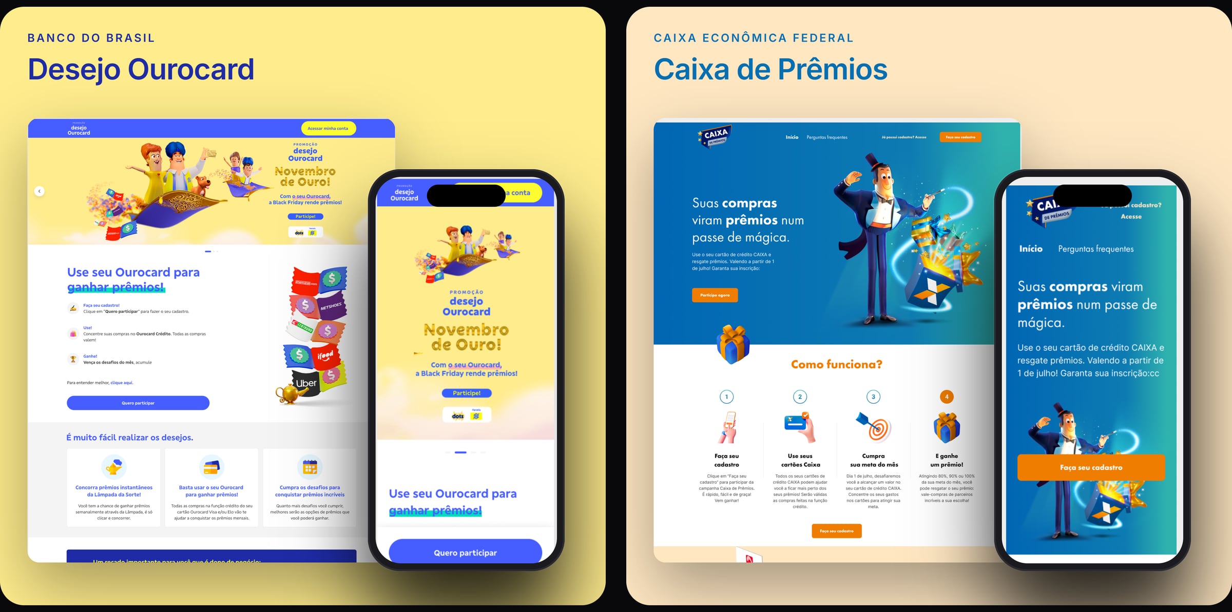
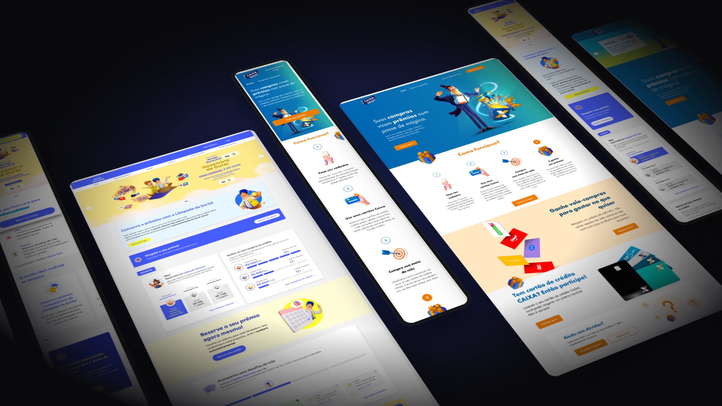
Both brands share the same flows and components, but they look nothing alike. Banco do Brasil has a genie on a flying carpet in yellow and blue. Caixa has a magician in blue and orange. Both run on desktop and mobile from the same code.
The mechanic
Different customers, different goals
The interviews showed that one goal for everybody fails at both ends. If you rarely use your card, a big goal feels impossible and you give up. If you already spend a lot, an easy goal changes nothing. So light users got an easier goal to keep them coming back, and heavy users got a harder one to push them a little further.
Listening after launch
Six problems, straight from customer complaints
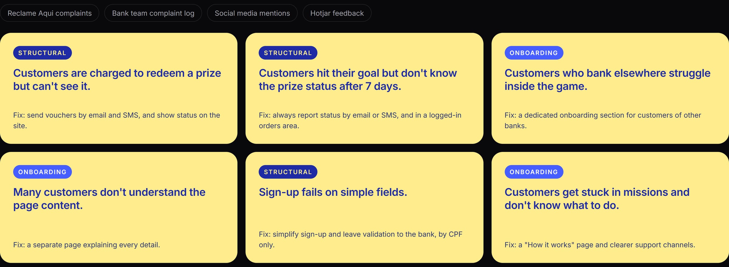
After launch, we went through every complaint we could find: Reclame Aqui, the bank's own complaint log, social media and Hotjar feedback. We picked the six biggest problems, split them into structural issues and onboarding issues, and proposed a fix for each one.
Dharma
A design system that changes clothes
Dharma has two layers. The base layer (fonts, spacing, corner radius, shadows and alert colors) is shared by every partner. On top of it sits a brand sheet with each bank's colors. Swap the sheet, and the same button, goal tracker and tier selector take on the other bank's look.
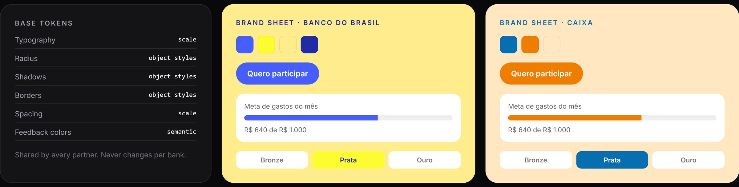
Color palette
- Ourocard Blue #465EFF
- Ourocard Yellow #FCFC30
- Ourocard Cream #FFEC8D
- Ourocard Navy #1E2BA5
- Caixa Blue #066FB2
- Caixa Orange #EF7D00
- Caixa Peach #FFE7C2
Typography

Inter, set in Dharma's base layer.
The whole product
Two brands, one experience
Landing pages, sign-up, the logged-in home with the monthly goal, on desktop and mobile, for both banks.
Up next

Kind words
Thiago approaches every project with a meticulous and user-focused mindset, and his keen eye for UX problem-solving results in thoughtful and beautiful solutions. Thiago is not only a skilled designer but also a dedicated and hard-working team member who brings energy and enthusiasm to every project.
 Adelina GreenProduct Design Manager, GoDaddy